Product Photography for TikTok Shop: What Actually Converts
TikTok Shop is not a search marketplace. Nobody types "wireless earbuds murah" into TikTok and compares twelve listings. Your product appears mid-scroll, between a dance clip and someone's dinner, and you have under a second of attention to stop the thumb. That changes what a "good product photo" means.
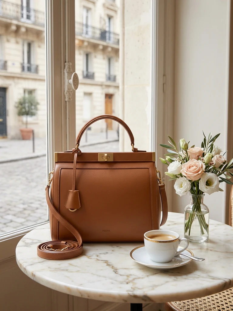
Most sellers copy their Shopee images across and wonder why the click-through is terrible. Shopee images are built for comparison — clean, white, informative. TikTok images need to be built for interruption. Here's the playbook.
How TikTok Shop uses your images
Your product images appear in more places than the listing page:
- The product card that anchors live streams and shoppable videos — tiny, so it must read at thumbnail size.
- The Shop tab grid, where you sit next to algorithmically similar products.
- The listing gallery once someone taps through — this is where conversion happens.
- Affiliate showcases, where creators who sell your product display your first image.
The first image does quadruple duty. Design it for the smallest size it will appear at: if the product isn't instantly recognisable at 150 px, start over.
The five image styles that perform on TikTok Shop
1. The bold colour pop
White backgrounds disappear into TikTok's bright UI. Listings that stop thumbs use saturated, high-contrast backgrounds — a colour block that clashes (pleasantly) with the feed around it. Think electric blue behind orange sneakers, not beige behind beige.
You don't need to reshoot for this: a background swap tool regenerates your existing photo onto a bold studio colour with matching shadows in one step. TikTok-specific scene presets exist precisely because this style is platform-native.
2. The lifestyle "caught in use" shot
TikTok's whole culture is authenticity, and listings that look like a creator's photo — product in hand, on a desk mid-use, worn out the door — convert shoppers who distrust studio gloss. Shoot these on your phone in real locations, or generate the scene around your product cutout.
One rule: the product must stay the obvious subject. A lifestyle shot where the product occupies 10% of the frame is a mood board, not a listing image.
3. The infographic card
For products with a spec story — battery life, capacity, materials — one image in your gallery should be a clean infographic: product centred, 3–4 callouts with icons, large type. Keep it to one idea per callout and a maximum of 6 words each; TikTok users read at scroll speed.
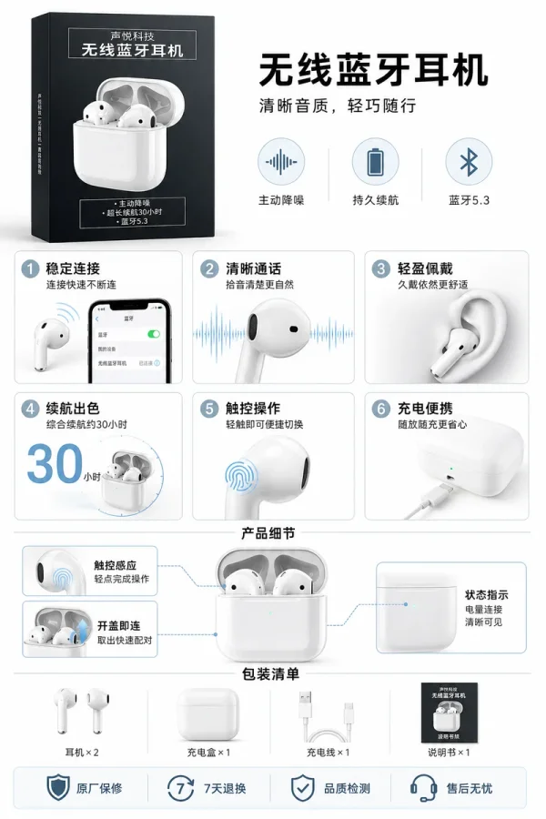
An AI ad poster generator produces this style directly from your product photo and a one-line description — typography, layout and callouts included — which is dramatically faster than assembling it in a design tool.
4. The before/after or comparison split
If your product transforms something (cleaning, skincare, organisation), a split image outperforms everything else. TikTok shoppers are conditioned by transformation content; the format is native to the platform.
Keep the split honest. Exaggerated "afters" drive returns and TikTok Shop's seller ratings weigh refund rates heavily.
5. The social-proof frame
A gallery image showing the product with review-style text overlay ("4.9 ★ · 2,000+ sold") borrows the look of UGC. Only use real numbers from your own shop — fabricated proof is both against policy and easy for buyers to check.
TikTok Shop image specs (2026)
| Slot | Ratio | Recommended size | Notes |
|---|---|---|---|
| Main product images | 1:1 | 1200 × 1200 px | Up to 9 images, JPG/PNG, max 5MB each |
| Variation (SKU) images | 1:1 | 600 × 600 px min | One per colour/size variant |
| Size chart / detail | 1:1 or 3:4 | 1200 px wide | Goes in the description section |
Always verify current limits in TikTok Seller Center — specs shift — but 1:1 at 1200 px has been safe for years. Generate at the largest size and downscale; never upscale.
A realistic production workflow
For a new SKU, you need roughly six images. Here's the workflow that takes an afternoon, not a week:
- Shoot once, properly. One clean phone session by a window — our no-photographer guide covers the 15-minute setup.
- Generate the bold cover. Background swap onto a TikTok-style saturated scene, 1:1.
- Generate one lifestyle scene that matches where your buyer actually uses the product.
- Create one infographic poster from the product photo plus your top 3 selling points.
- Shoot one honest in-hand photo. Don't generate this one — its authenticity is the point.
- Add one social-proof or promo frame in a free editor with your real numbers.
Total cash cost using AI tools: a few ringgit per SKU. Total cost of having a "TikTok-native" looking shop versus a copy-pasted Shopee shop: that's the difference your CTR will show you within a week.
What about video?
Video outsells images on TikTok — that's real, and you should make simple product videos. But images remain the floor of your conversion funnel: the product card, the affiliate showcase and the gallery are image surfaces no matter how good your video is. Sellers who nail images first also have better raw material for video thumbnails and live-stream pins.
Get the six images right, then point the same phone at the product and start talking.
Try it on your own product photos
Product DIY turns one casual phone photo into professional listing images, ad posters and try-on shots. New accounts get 500 free credits — no card needed.
Try AI Ad Poster