White Background Product Photography: DIY Setup vs the AI Shortcut
The white background product photo is the uniform of e-commerce: Shopee and Lazada recommend it for covers, ads enforce it, Amazon outright requires it, and a shop whose listings all share clean white covers instantly reads as a brand rather than a reseller.
It's also harder to shoot properly than it looks. Point a phone at a product on white paper and you'll get a grey background, weird colour casts, and shadows in the wrong places. This guide covers both reliable routes: the physical setup that costs about RM30, and the AI route that skips physics entirely. Most sellers end up using the second — but understanding the first tells you what "correct" looks like.
Why your white background comes out grey
Camera meters average the scene toward middle grey. A frame full of white paper tells the camera "too bright!", the camera darkens the exposure, and your white becomes dingy grey. Professionals solve this by lighting the background separately from the product — which is why real white-sweep photos need multiple lights.
This single fact explains most disappointing DIY results, and why the fix isn't a better phone.
Route 1: the RM30 physical setup
If you want genuine in-camera white shots:
You need: a sheet of white card bent into a seamless curve (no horizon line), a large window with indirect daylight, a second white card or foam board as a reflector, and a phone with the lens wiped clean.
The method:
- Place the curved card on a table side-on to the window, product 20–30 cm in front of the curve.
- Position the reflector on the shadow side, angled to bounce window light back — this kills the harsh side shadow.
- Tap-focus on the product, then drag exposure up until the background reads white but the product still holds detail. This overrides the grey-trap above.
- Shoot slightly wide; you'll crop to square later.
The honest limits: you'll still spend a few minutes per image in an editor pushing the background to true #FFFFFF (search "levels" or "whites" slider), edge shadows will vary between sessions, and dark or reflective products on white remain genuinely difficult — they pick up the white surround in reflections and lose edge definition.
It's a fine route if you enjoy the craft. The reason most sellers don't bother anymore:
Route 2: shoot anywhere, generate the white
The AI route inverts the problem. Instead of forcing physics to give you white, you shoot the product for maximum detail — any plain background, good window light, contrast between product and surface — and let software produce the white version:
- Photograph for sharpness, not background. A dark product on a light table, a light product on a dark table. The advice in our no-photographer guide applies in full.
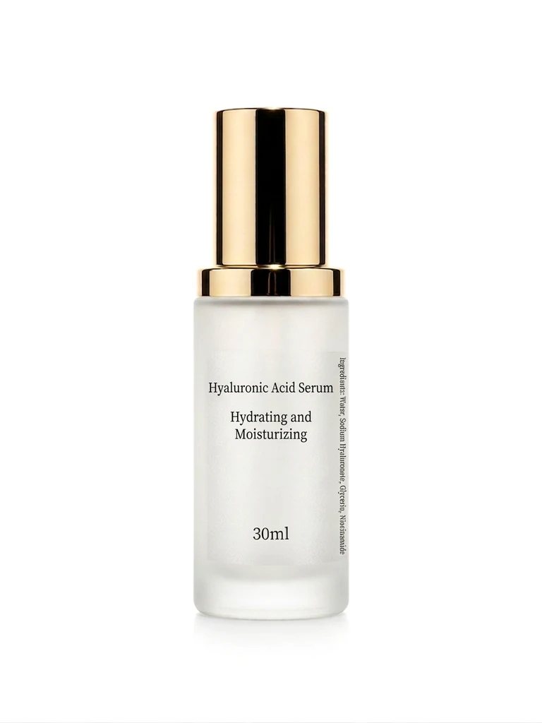
- Option A — the cutout route (RM0): run the photo through a free background remover, drop the transparent PNG onto a pure white 1200 × 1200 canvas, add a soft ellipse shadow at low opacity. Compliant cover, three minutes.
- Option B — the studio-shot route (~RM1): run the photo through AI background swap with a clean white studio preset. The model regenerates a true white sweep with physically correct contact shadow and ambient occlusion — the look of a multi-light studio setup, from one window-light phone photo.
The difference between A and B is the shadow. Cutout-on-white reads as "catalogue"; generated studio white with natural shadow reads as "brand." For covers both pass marketplace rules — pick by the look your shop is building.
What the AI route handles that the lightbox can't:
- Dark and black products — no more grey halo where the edge meets white.
- Reflective surfaces — regenerated reflections match the new white environment instead of mirroring your room.
- Consistency across a catalogue — every SKU gets the identical white treatment regardless of which day or room you shot it in. This uniformity is what makes a shop page look like a brand.
- Seasonal pivots — the same source photo also generates your CNY red, Raya green or 11.11 campaign backgrounds later. The lightbox only ever gives you white.
Marketplace white-background rules, quickly
| Platform | Cover background | Min/recommended size |
|---|---|---|
| Shopee | White/light recommended; required for some ads | 1024 × 1024 px, max 2 MB |
| Lazada | White required for campaign placements | 1000 × 1000 px+ for zoom |
| TikTok Shop | No hard rule; bold colours actually outperform white | 1200 × 1200 px |
| Amazon | Pure white (RGB 255,255,255) required | 1600 px+ longest side |
Details per platform: Shopee guide · Lazada guide · TikTok Shop guide.
Note the TikTok row — white is the uniform of search marketplaces. On feed-based platforms a white cover disappears into the UI. Same product, different background strategy per platform, which is precisely the case for generating backgrounds instead of shooting them.
The checklist for a publishable white cover
- Background is true white at the edges (sample it: 250+ in all RGB channels)
- Product fills 80–90% of the square frame
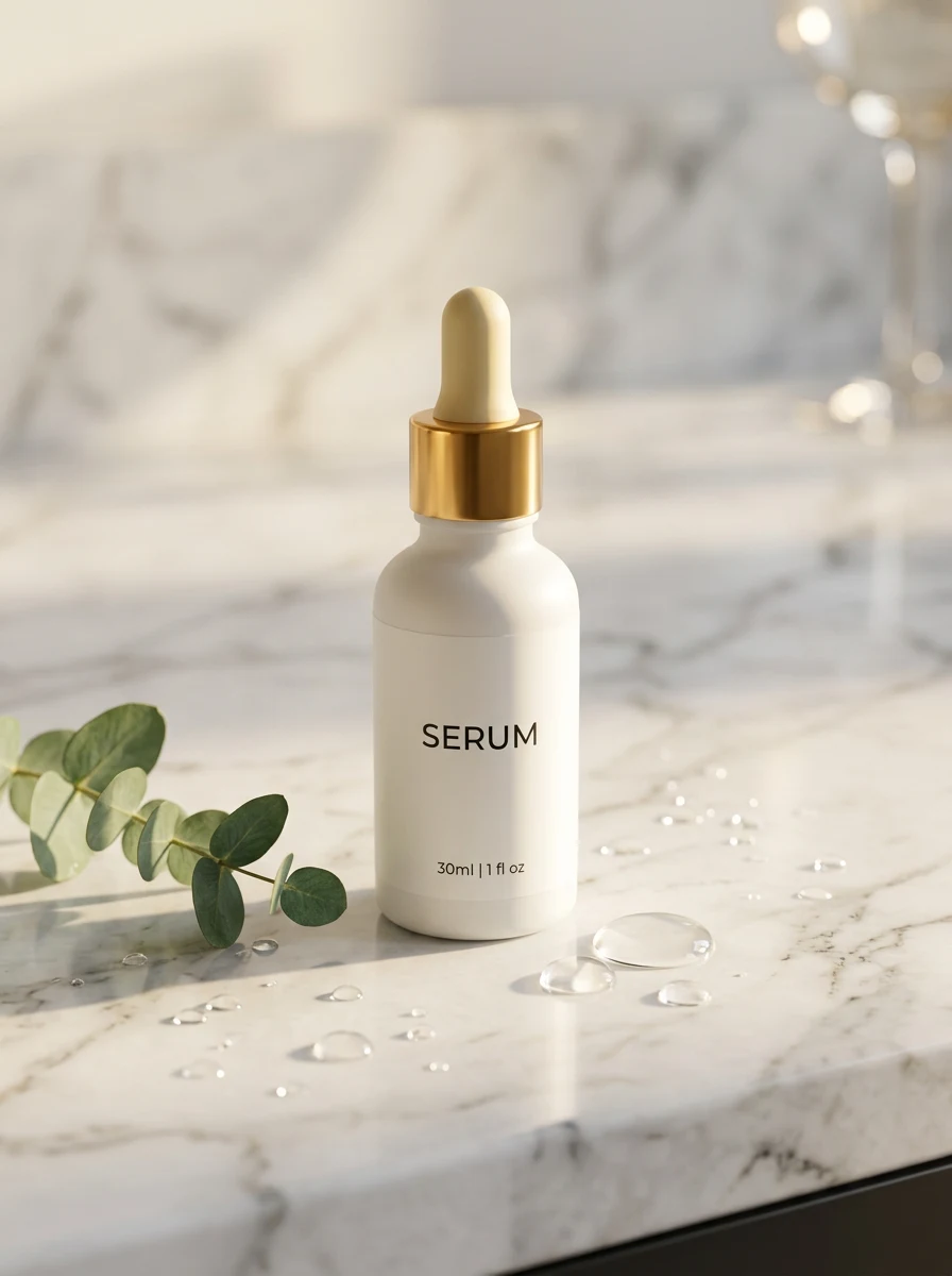
- A visible but soft contact shadow grounds the product (floating = fake)
- Edges clean at 100% zoom — no halo, no chewed details
- Colour true to life — verify against the physical product under daylight
- Exported 1:1 at 1024 px+ (2 MB JPG cap for Shopee)
However you produce it — card and window or one AI generation — the white cover is solved infrastructure now. Spend the time you save on the images that differentiate: the lifestyle scene, the detail shot, and the honest in-hand photo nobody else in your category bothers to take.
Try it on your own product photos
Product DIY turns one casual phone photo into professional listing images, ad posters and try-on shots. New accounts get 500 free credits — no card needed.
Try AI Background Swap